Maven Airlines Challenge
- sarahmriecke

- Jun 29, 2022
- 7 min read
How I created my Maven Airlines Boarding Pass challenge dashboard.
Background
The Maven Airline challenge ran from the end of May to mid June. These challenges are only a one page report/dashboard.
The task of this challenge specifically was to analyze the data and fine key areas to focus on for getting customer satisfaction back above 50%.
The dataset included airline satisfaction score for about 1,300 passengers. Information included passenger demographics, flight distance and delays, travel class and purpose, and more.
My Approach
For this challenge, I wanted to have fun with the design element. I personally love to travel, so this was a great time to play around with my passion for travel as well as business intelligence.

I had a goal to create a report that looked like a boarding pass. This meant that the overall feel of the report would be more infographic. Most of my design previously have not been infographic based, and more report like.
To make this feel as much like a boarding pass as possible, I knew that I would need to pay attention to all of the little detail from text font and size, placement of text, bar code, flight information, etc. To help with all of these, I searched for images of boarding passes to get inspiration.
As for the analytics part of the design, I knew I wanted to focus on the two main classes: Business and Economy. Since I was dong the boarding passes, I could create one pass per class. From there, each class includes KPIs for the average departure delay, average arrival delay, and average distance. They also include graphs for travel type, overall satisfaction and customer type. Lastly I picked four different areas to focus on that seemed of importance from my experience when flying in each class. For Business Class I focused on seat comfort, in-flight service, in-flight WIFI service, and food and drink. For Economy Class I focused on in-flight entertainment, in-flight service, cleanliness, and baggage handling.
Design Process
The whole report was created using Power BI with a few elements created using icons from Microsoft word and images being found on the web.
Below is a video going through all of the layers that show the boarding pass coming together. These are a lot of elements, which are described in the steps down below.
Before getting started with the steps below, I also recommend searching the web for inspiration photos (like the one I used below).

Please note: In the video I do not explain each thing step by step, but instead show how the boarding passes were built.
Step 1:
Create the background. This is created utilizing multiple shapes and some imported images.
I created a rectangle as the base of the boarding pass. The size of it was just eyeballed to where I would have enough space and the proportions looked similar to an actual boarding pass. From here I rounded the corners of the border of the box (this part can be skipped if placing on a white background).
Next I worked I added the top and bottom borders. These shapes are the rounded tab shapes. The top shape is rounded on both top corners and is a bit thicker than the bottom border. The bottom border uses the rounded tab, both bottom corners. These are then placed to match the rounded corner to those of the rectangle (again you don't have to worry about this much if using a white background). I you do align them, make sure that no white of the bottom box is showing.

After that was done, I used Microsoft Word to create a dashed line that was very light grey. This was to be used to make it appear that there is a perforated edge on the boarding pass stub. Then I inserted the image. The placement was determined based on references from real boarding pass images. It is aligned to about the right 1/4 of the boarding pass (or slightly less, whatever looks right to you). You will want to ensure you have room for the "flight details" to the right as well as enough room for the visuals to the left.
Then I found an image of the world map in a black color and utilized Power Point to make that image transparent. I then added this image to the back of the boarding pass, making sure it was centered on the whole thing.

Lastly, I added two white circles (to match the background color) and placed them centered on the dashed line. The bottom border is where the circle met the top, and on the top board I tried to match hard far up the bottom circle came so they looked even. This part is optional though if you don't have a solid colored background.

Step 2:
Add the text that starts to bring the boarding pass to life with additional details.
First, I start with trying to find a font that was native in Power BI that looked similar to text often found on real boarding passes. After looking through the list, I settled on Courier New as the font to use throughout the report.
The next bit I worked on was the logo. Since the prompt said this was for Maven Airlines, I went with that. In the font I picked, I added "Maven Airlines". I didn't get all fancy with a logo, but if you wanted to you could replace with this a real logo. To add to it, I found a plane icon to add to the right of the text.
After that, I worked on adding "BOARDING PASS BUSINESS CLASS" to the top border. I went all caps here as inspired by my boarding pass images that I used as inspiration. Business Class was put as a smaller size under the Boarding Pass. This was included on the left most of the "main" part of the ticket (or the visual part) as well as centered on the stub part of the ticket.
Next was the flight details that would go on the right hand stub part of the ticket. The layout of this was inspired from actual boarding passes. The flight information was similar to an existing flight that I was taking (with a random flight number for privacy reasons), but this information can be totally made up. I left space at the bottom of the stub part to be able to add a fake barcode (this is totally optional). If you do want to add a barcode, that is described in the next step where I cover the visuals.

Lastly, the text on the bottom border was added. On the left hand side as well as centered on the stub part on the ticket, I added the ticket/confirmation number (this is just a random combo of letters and numbers). Then, centered on the whole ticket I added a note "Please be at the gate 30 minutes prior to boarding time."

Step 3:
Add your visuals and final touches. This include adding additional images to the boarding pass, such as the barcode I mentioned above, or any of the actual analytical visualizations.
First, I am going to finish the rest of the boarding pass look by adding a barcode. I just searched the web for a fake barcode that looked similar to a boarding pass barcode and added that on.

Next I worked on adding the KPI cards. Based on the size of the boarding pass dedicated to the visuals, I decided that three KPIs across the top would be best to not overwhelm and crowd the space. Height wise, these take up about 1/3 of the space, leaving room for two more rows of visuals to be added later. These KPIs use the same text that was used to create the rest of the boarding pass. Text sizing was really up to what felt right without being overwhelming and leaving enough space for everything else without getting cut off.
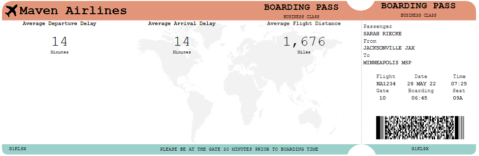
Next I chose 4 different areas of satisfaction (that seemed important to Business Class fliers). Since I was going to use a 5 star visual to represent the rating, I had room for 4 of these visuals across the bottom of the card. These took up less than 1/3 of the height for all visuals (leaving just over 1/3 left for the middle visuals). These were created using a custom visualization called Ratings by MAQ software.

Lastly was the middle row. This was going to include bar charts on three different areas of important: travel type, overall satisfaction and customer type. These were going to be small given the space left, so only 3 visuals would best fit across the remaining space.
Now with the 3rd row of visuals in place, something was needed to add a bit of separation between them all. I decided to add lines between each of the rows, but very transparent and not super noticeable. It is just enough to break up the white space and text some.

Step 4:
Picking your colors! Throughout the rest of the steps above, the color palette is already cohesive, but when I first built this out, that was not that case. It wasn't until towards the end that I applied a color scheme to the report. I wanted to make sure that all of the elements I needed were there before adding the colors.
To pick a color palette, I utilized Coolors.co and search existing palettes to find one that peaked my interest. From there, I edited the current theme within Power BI to add in the colors I wanted. From there, I colored the rest of the report from the top and bottom borders to the filled in stars to the bar graphs.
When keeping the colors in mind, I tried to use different colors in the visuals if they had an legend to help differentiate between different visuals.
Step 5:
Once one boarding pass is completed, if you want to create another, you can group all of the layers together and create a duplicate and change the filters and visuals as needed.
Just like that, you have the final product!

Final Thoughts
While this tutorial makes the design process look easy, it was a lot of tweaking and trial and error while creating it for the first time. With all of the options Power BI provides though, it doesn't take any editing software or design knowledge to create reports like this. With some searching on the web and imagination, there are a lot of possibilities when it comes to report design in Power BI.
This was my first Power BI report that was more infographic than business dashboard, and I had a lot of fun with it. I enjoyed exploring my creative side while creating and interesting and insightful report.


Excelent!!!! Do you need a paid power bi account tondo this?